While we were redesigning a brand strategy, we helped bring across what was most valuable to Katrin from a business strategy perspective. What Katrin meant to its users. It wasn’t a mere tissue brand – it was the daily reminder of how cleanliness is a basic right.
Katrin is a 40-year-old tissue and tissue dispenser brand belonging to Metsä Group, a Finnish pulp and paper company present in 30 European countries. They make a range of high-quality pulp products from renewable Nordic wood. Metsä Group’s sales totalled 4.7 billion EUR in 2016, and it employs approximately 9,300 people.
![]()
Katrin’s biggest competitor is Tork (part of SCA, a huge Swedish paper company). They had a fresher look and were gaining market share from Katrin, which still unfortunately had a visual identity reminiscent of thick red power ties from the 80s.
Katrin’s upcoming dispenser model was designed in Norway with an inclusive method – trying to make it possible for anyone to use, whether you’re blind, arthritic, in a wheelchair, or if you’re just a kid trying to reach the tissue dispenser.

To coincide with the launch of the new dispenser, our team at the service design agency N2 Nolla put together a brand strategy to both revive the old Katrin brand and send a message of inclusivity throughout the company.
User research: figuring out the key need of the customers
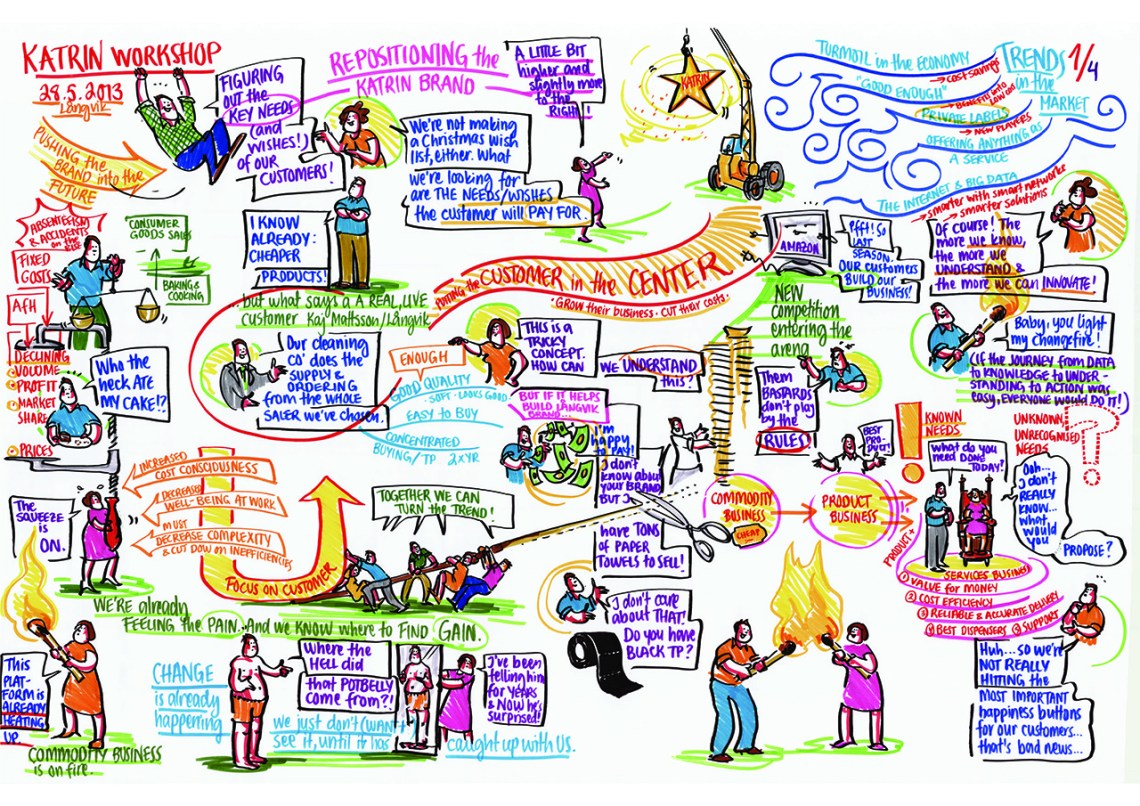
We conducted workshops and user research studies together with the client and it became apparent that the brand needed a refocus towards the trusted quality of product design, pure materials and Nordic efficiency, which have been the cornerstones of Katrin’s long client relationships.
Brand strategy: Inclusivity and Nordic cleanliness
The brand strategy revolved around inclusivity, which is a mainstay of Nordic social democracy. The business side of the brand strategy focused on Nordic cleanliness that didn’t mean only tidy minimalistic houses but also the icy pureness of Northern nature.
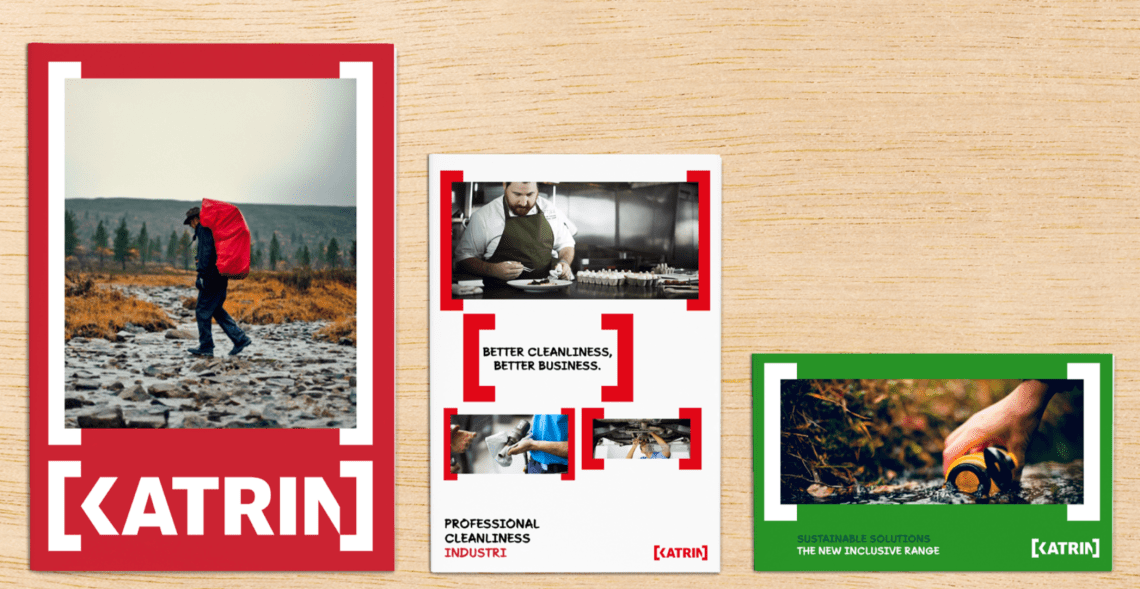
![]() The new logo that we designed for Katrin was clean, simple and adhered to Nordic aesthetics and still retained the identifiable thick slab shape of the old logotype.
The new logo that we designed for Katrin was clean, simple and adhered to Nordic aesthetics and still retained the identifiable thick slab shape of the old logotype.
The new brackets in the logo communicate inclusivity, the main design driver for Katrin. They are brand elements which can contain text, images, videos or any Katrin content.
From the main brand points of inclusivity and Nordic cleanliness we derived the brand values. I wrote this manifesto about the core value of Katrin: how cleanliness is a basic right. 
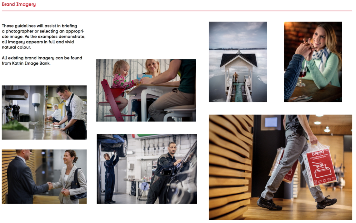
I devised the tone of voice of the brand from the values as well.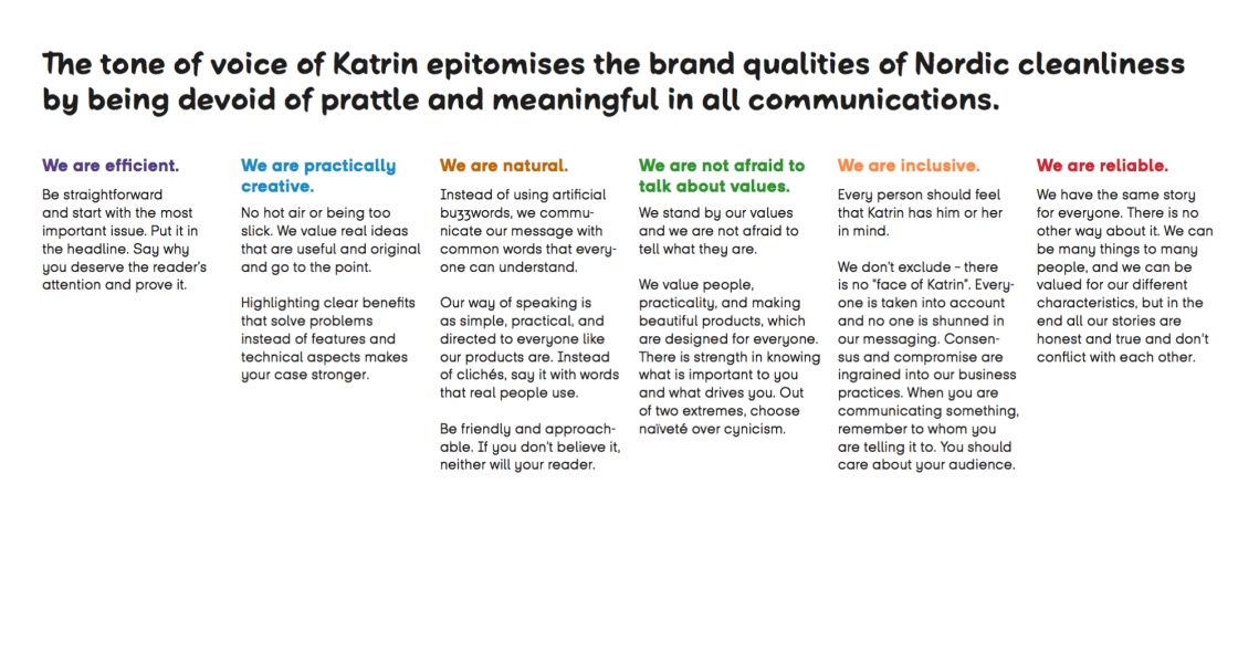 We created a brand book with new fonts, imagery and a library of icons for use online or on packaging. They had a positive, human warmth instead of an industrial, sterilised look common to competitors.

Business strategy: from products to services
One of the issues facing Katrin was that they were trying to stay out of just being in the commodity business (tissues) and concentrating on their product business (dispensers). Moving them to the service business is where we believed they would find their competitive advantage.

As a B2B brand, Katrin had several stakeholders: their corporate clients, cleaning companies, facility managers and of course their end-users. Katrin needed a new inclusive way of doing business with customers, which involved their salespeople really getting into those insightful conversations with their cleaning company clients to understand their business and cleanliness processes.
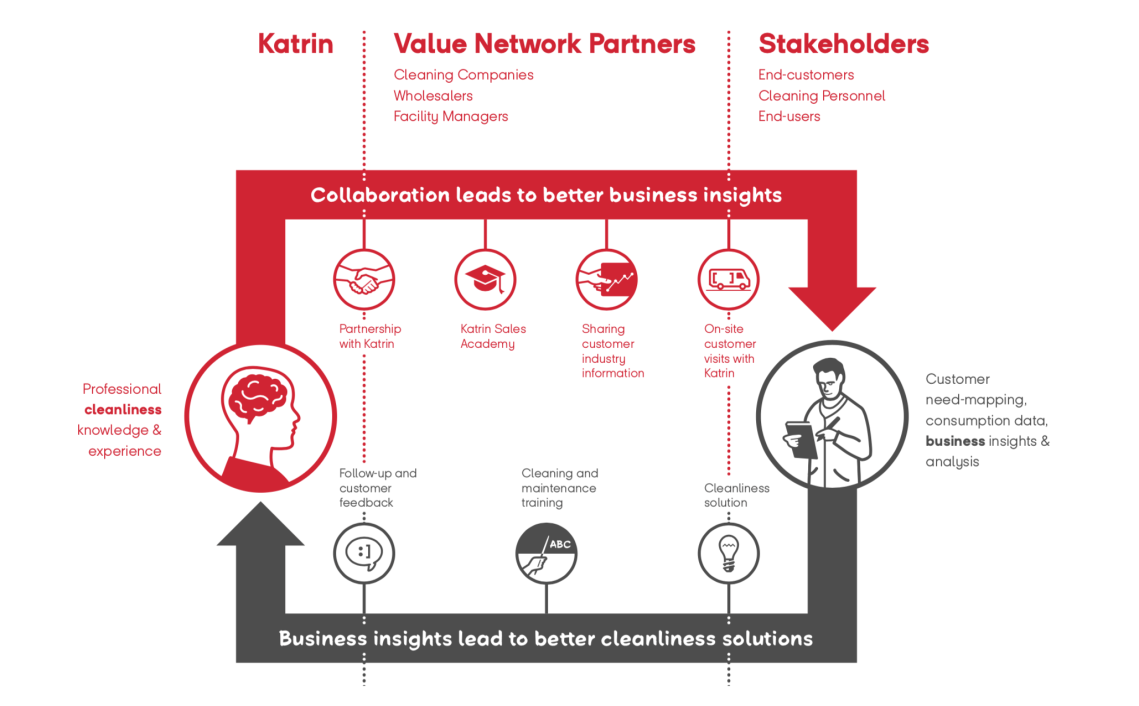
I conceptualised this new process schematic to show the best way of working for Katrin as a service provider. By positioning themselves as the supplier of cleanliness solutions for their clients, they can create a toolbox for more value-based sales. Clients will contact Katrin for unique cleanliness knowledge, experience and insights and Katrin will provide better service to their clients.

It was based on this Katrin tissue, on which I scrawled the first draft of their new user-centered method of working.
We created an internal engagement plan to motivate and encourage salespeople to spread the new gospel of inclusivity and sharing insights. The work methods required the sales representatives to take a new more proactive approach, with them focusing not just on selling more paper, but on getting more information from their clients on what their end-customers need and how Katrin can solve those issues.

This was a fantastic experience for me of using service design methods to find how to combine brand strategy with business strategy. In the end, what Katrin thought they needed, a visual redesign of the brand, was just the tip of the iceberg. What remained in the company went much deeper as a result of all the workshops and co-creation. A more profound understanding of their business changed the way Katrin’s own people valued their work. And when you have purpose, performance follows.
