Oman has one of the most overbanked regions in the world with over 60 banks for a country of just 9.5 million people. Siegel+Gale worked with Bank Sohar, an 11-year-old Omani bank in a growth spurt, who saw a need to freshen their brand with the primary goal of framing them as the bank with best customer experience in the region. We created a new visual identity and a new name – Sohar International. As S+G’s Digital Experience Director for the EMEA region I believed it was crucial that the new identity was matched with a new banking experience: a purposeful approach and reliable, customer-friendly digital services, starting with their website all the way to their banking app and ATMs. I wanted to upgrade the actual user experience of the bank’s customers and make it evident in the new brand.
Digital Strategy + Brand Strategy
The new brand strategy of being an international Middle-Eastern player that is “in the game” – analytical, decisive, confident – had to be evident in the new digital experience as well. The bank wished to signal that:
• the bank was open to international customers,
• was up-to-date in its use of digital channels,
• and that the important customer groups of high-net-worth individuals and large businesses were paid due attention.
In addition to the business goals, I outlined the strategic goals for the bank.

Research
I began the research with a thorough competitive audit and an audit of the existing channels.

The competitive audit of Middle-Eastern banks showed that Emirati banks are most ahead in their digital channels. In general, it could be noticed that the banks in Oman hadn’t fully adopted digital transformation and instead were showing incremental steps towards more digital interactions with their customers. The banks in Oman were very similar to each other in terms of services and the way they presented themselves: a desktop-first approach, an incoherent information architecture and sites which were too chock-full of marketing copy.

From the site audit, it was obvious that the portal-type site was outdated and there were too many stakeholders trying to get real estate on the front page. I found many inconsistencies with the information architecture and navigation, which made it difficult to find the right content. The site wasn’t mobile-friendly, which is a prerequisite for any user who’s been alive in the 2010s. The backend solution was also a hindering communication between the bank, its vendors and the customers.
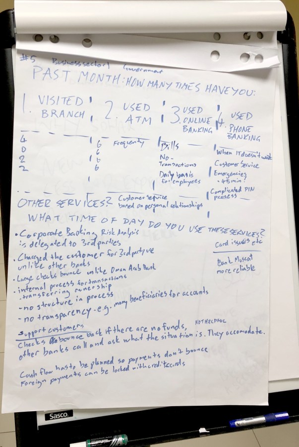
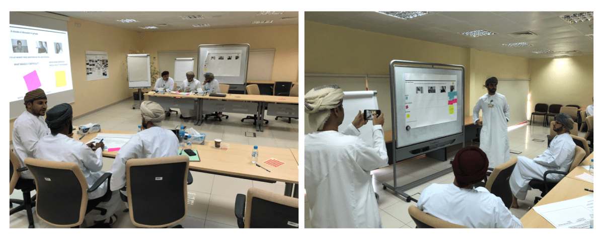
User research
The guiding north star of the project was simplicity, in terms of what it means to the actual users. We conducted qualitative focus group interviews with the bank’s customers in Oman, asking them about their banking brand preferences and more importantly, their banking behaviour and experiences. I found out some really interesting insights from the interviews that might not have come out otherwise. To name a few findings, which would later have concrete implications when building the site:
- Banking needs are very dependent on the life situation you are in
- Business customers require retail services too
- Women conduct a lot of an Omani household’s banking
- Many people hold their money in foreign currencies
- Omanis are highly indebted and the main reason to choose a bank is an attractive loan offer, so it is vital to have the terms and checklists very clearly visible
- Banking over the phone is a nightmare
- What most people need is an easy way to find the detailed information you are looking for
- And, most importantly, people will much rather use digital services if they are available
These findings were starkly in contrast with the existing site, which was more about selling the bank’s image and the quality of its products. A lot of the required detailed content was missing.
Based on the strategy and the research, I outlined the five strategic imperatives for their digital experience.
- Simplify – make the experience intuitive to navigate and relevant to the user
- Reinforce the brand – articulate the new brand digitally and reinforce your culture
- Support the sales funnel – guide customers from awareness and interest to sales
- Educate new customers – expose existing customers to new service offerings
- Bring the technical platform up to date – a fast loading, modularly scalable, easy to maintain site
Workshopping with our user personas
Based on our interviews with the users and the department heads at the bank, we created four distinct user personas, with their own family and business backgrounds, desires, hopes and frustrations.

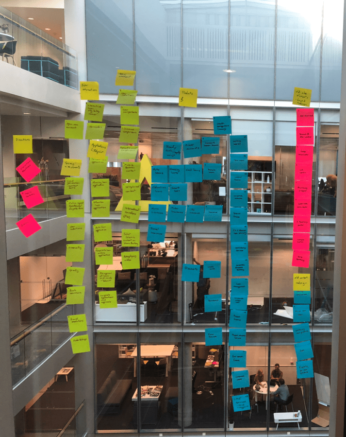
We organised a workshop for 20 key stakeholders in the bank to go over our results, investigate customer journeys and to find opportunities for the digital banking experience. We went over the different user stories for the personas and their life triggers, which are the most crucial for customers when they are choosing banking services.
Customer journeys
The results of the customer research allowed us to create customer journeys for each of the user personas. The journeys were based on life events and divided into an Awareness/Consideration phase, a Decision/Delivery phase and a Use/Loyalty phase. Each phase had:
- key events that the customer is experiencing (user stories),
- actions they take,
- touchpoints that they use,
- painpoints they face,
- the best/worse case scenarios.
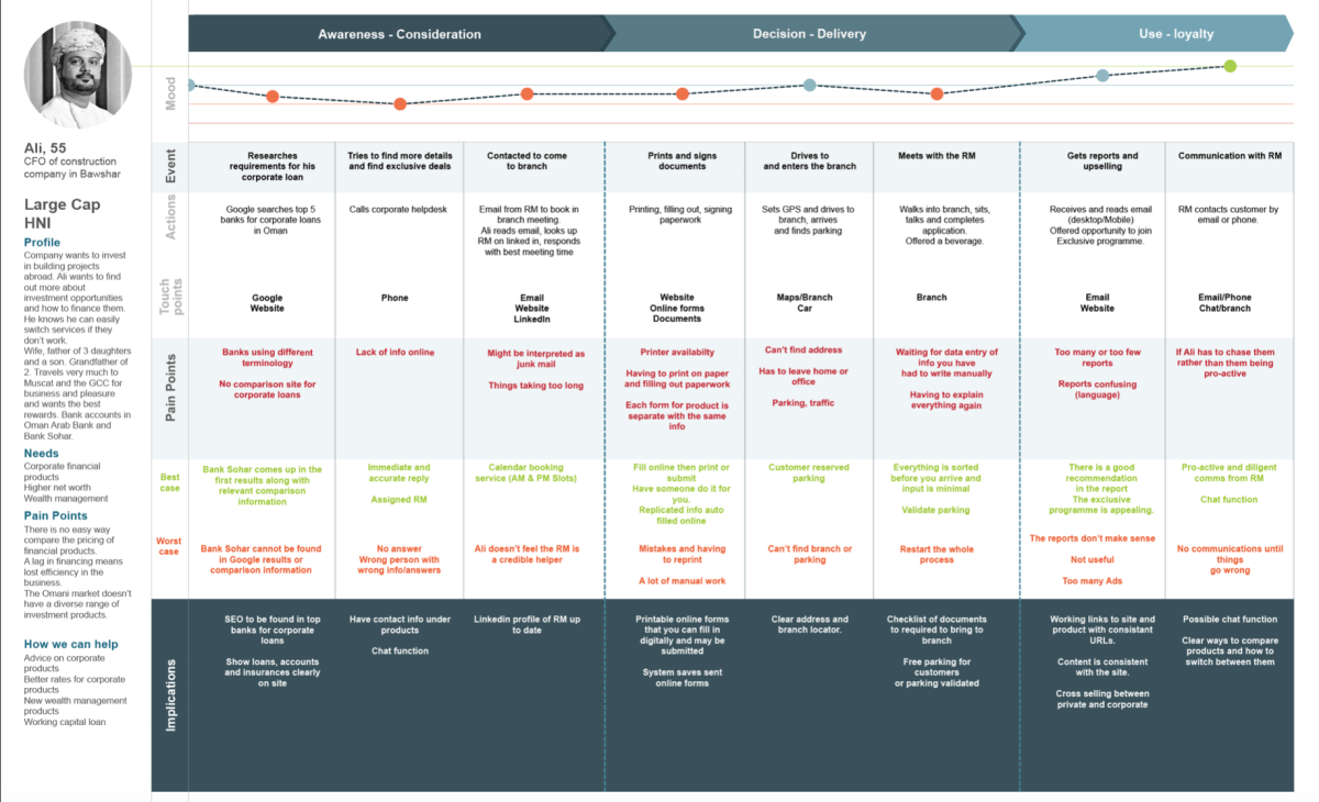
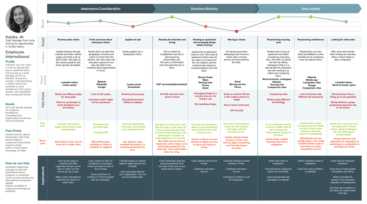
I also outlined implications that could be derived and used for the development of the customer experience. Note that these omnichannel customer journeys are not just digital but take into account all the analogue experiences of the customer as well, e.g. driving to the bank or printing documents.
Functionalities
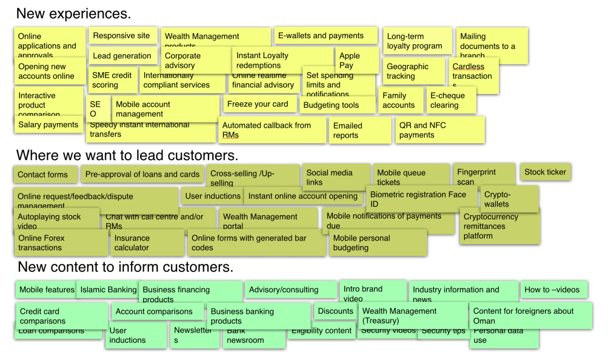
From the fleshed out customer journeys and our workshop, I created a list of minimum viable functionalities that would be required in the digital banking experience.

I put the functionalities together in an affinity diagram to create a hierarchy of what are the main groups of functionalities and colour coded them with post-its on one of our meeting room walls.
Design and prototyping
From this point it was time to create some prototypes of what the end product could be like and what the experience was that we were going after. I had the help of a UI designer for these. We started with wireframes to test and see if they fit the user stories we had created.

These were turned into more high fidelity wireframes, once we had an idea of the new brand identity and we had confirmation that the structure of the site works.
The information architecture of the site was also based on user research and seeing where the traffic of the site was actually going. Every path in the site should be logical.

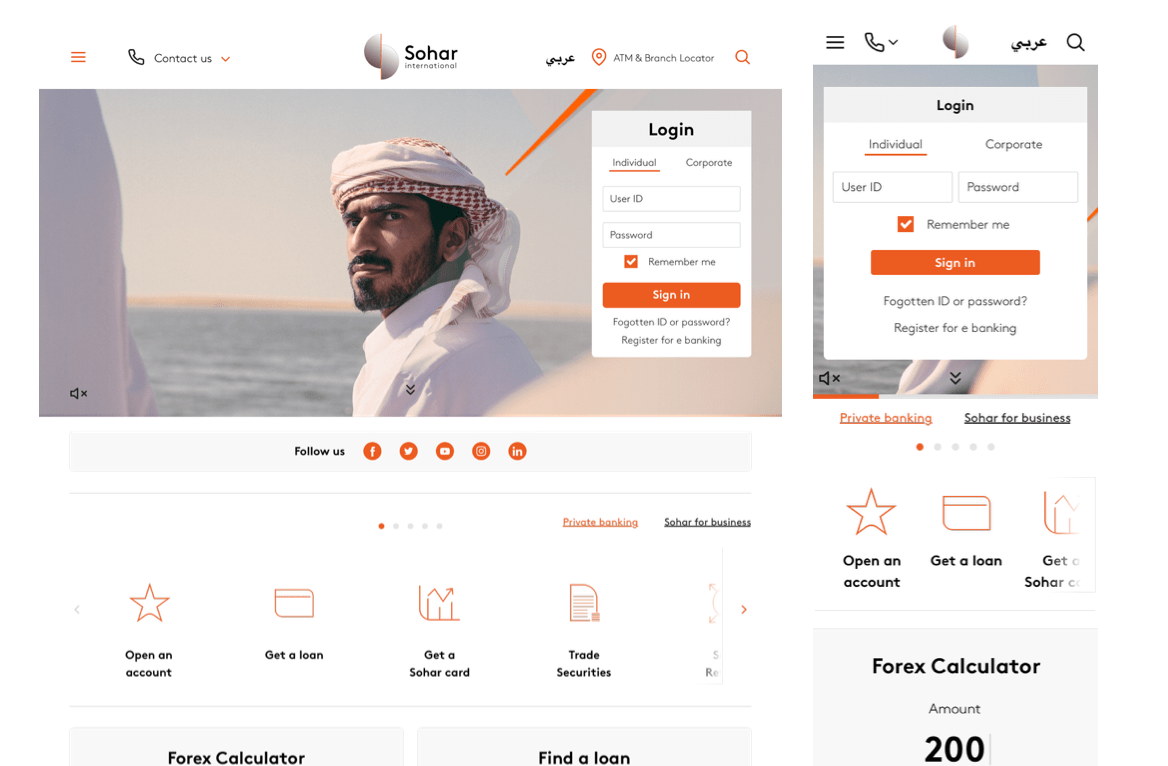
We wanted to make it as easy as possible for users to find what they were looking for. Over 60% of users would go straight to the login to e-banking so we it prominent.
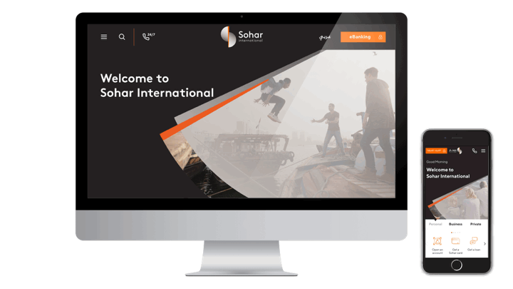
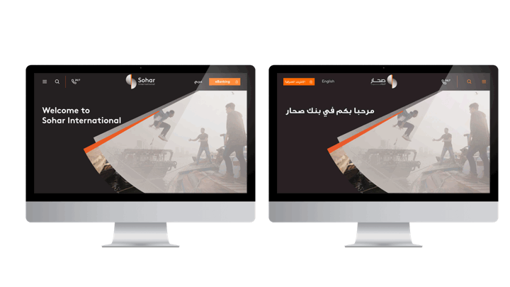
When the brand identity was finalised and the name was settled on, we could make the final designs of the site. The bank was named Sohar International.

Development
We used Vega IT for front-end and back-end development and I can’t recommend them enough.
We chose Umbraco for the back-end, because it is very customisable, integratable with other systems, had a very easy CMS interface and a wealth of documentation and training videos for the bank’s admins.
Launch
The site was launched in 2019. In addition to the web site, we also redesigned their mobile banking app and their ATM screens. Sohar International announced a 14.22 % rise in net profits in the first nine months of 2019. According to the CEO of the bank in the Times of Oman:
The entire website user experience is structured around and built on the principles of the bank that aim at providing more value by having engaging content, more velocity by having quick and easy access to information, and more vision by demonstrating what and how the bank will be able to deliver to its stakeholders. This is an extension to all other activities done by the bank that will contribute towards the purpose of helping our people win through our diverse range of responsive banking solutions for their dynamic world.
–Ahmed Al-Musalmi, CEO
