One of Finland’s premier nationwide bus services, Pohjolan Liikenne, wanted to freshen up their advertising, in print and in digital. Bus traffic had become more competitive and it was important to convey all the benefits that Pohjolan Liikenne could offer with simple visual cues.

The insight for their branding was that they already had something visual, which they hadn’t properly utilised and that they could own in the Finnish market: the colour purple.
We started with changing the colour of their most visible visual element, their buses.

The copy above the icons says ‘In here you can find’
We created a new identity for the bus company and a new simpler visual method based on icons and silhouettes for their communications, both analogue and digital.

‘How about browsing what your mates have posted. Always in the comfort zone.’

‘Lay down and relax. Always in the comfort zone.’
The messages were made to be as direct and legible as possible so you could read it on a quickly passing bus. The ads were featured in print, social media and of course on the buses themselves.

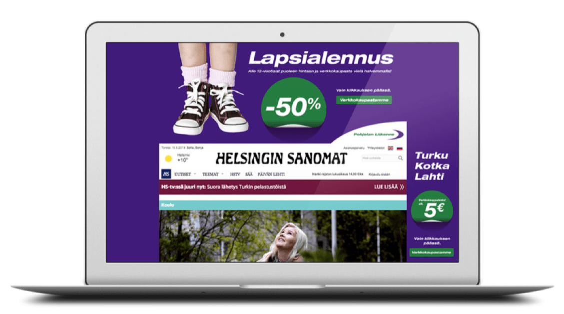
‘Child discount -50%’
The new purple buses garnered a lot of attention on the motorways of Finland and we put that to use in a Facebook and Instagram competition to spot their shiny new buses on the road.
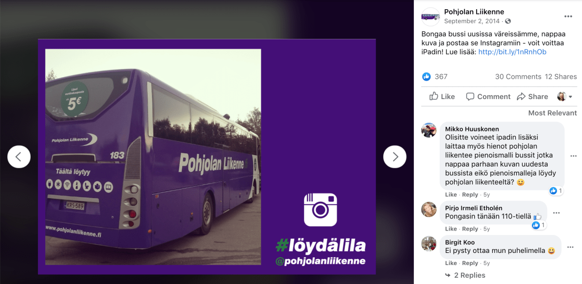
@pohjolanliikenne

The colour change was so noticeable, we actually got some local newspapers to write about Pohjolan Liikenne!

